7. Plotting
All of the tools we have used so far have been part of the Julia standard library. In this lesson we will use an external package for the first time: a plotting library called Makie.jl.
Makie.jl is a powerful, modern plotting library that is easy to use and produces high-quality visualizations. It has a GPU-accelerated backend for fast rendering and interactive plots, a static vector graphics backend for high-quality publication-ready plots, and a web-based backend for interactive plots in the browser.
Check out the official Makie tutorials for examples and documentation.
Before we start
Section titled “Before we start”Makie’s Getting Started tutorial is very well written and, honestly, I can’t do much better for an introduction. Please work through it before continuing.
We already installed Makie in the first chapter, but here is a quick reminder.
Install Makie
Section titled “Install Makie”There are three backends for Makie for different use cases:
- GLMakie: a GPU-accelerated backend for fast rendering and interactive plots.
- CairoMakie: a static vector graphics backend for high-quality publication-ready plots.
- WGLMakie: a web-based backend for interactive plots in the browser.
You will select one of these depending on your needs.
Here we will use GLMakie, but you can also use CairoMakie. Recall from the introduction that you can install packages in Julia using the package manager.
- Open your
tutorialfolder in VS Code. - Start the Julia REPL from the command palette (
cmd+shift+pon macOS orctrl+shift+pon Windows) by typingJulia: Start REPL. - In the REPL, type
]to enter the package manager. (Hit backspace to exit the package manager and return to the Julia REPL.) - Type
add GLMakie(oradd CairoMakie) to install.
Before we start plotting, let’s make a new folder called plotting or similar in your tutorial folder.
Then open the folder.
To use a package in Julia, you need to import it. This is usually done at the top of the file like this:
using GLMakie # or CairoMakieNow let’s make a simple plot.
Make a basic plot
Section titled “Make a basic plot”Figures and Axes
Section titled “Figures and Axes”In Makie, the Figure is the top-level container object.
An Axis is a container object for plots.
We can place one or more Axis objects in a Figure to create a layout.
Let’s try this step by step in VS Code.
using GLMakie
f = Figure()f
Hit alt+enter to run all of the code in this file. You should see a blank figure window pop up.
The code might run slow at first.
This is because Julia is a just-in-time (JIT) compiled language, meaning that it compiles code as you need it.
The first time you run the code, it will take a bit longer to run.
But subsequent runs will be much faster.
Think of a Figure as a blank canvas on which to place axes, plots, and labels.
Now let’s add an Axis to the figure.
f = Figure()ax = Axis(f[1, 1], title = "First Axis")f
You can see that it takes up the entire figure.
Let’s make another Axis in the first row and second column of the figure.
f = Figure()ax = Axis(f[1, 1])ax2 = Axis(f[1, 2])f The first axis resizes to accommodate the second axis.
An
The first axis resizes to accommodate the second axis.
An Axis can span multiple rows and columns.
f = Figure()ax = Axis(f[1, 1])ax2 = Axis(f[1, 2])ax3 = Axis(f[2, 1:2])f
These are just the basics of the powerful layout system in Makie.
For now, let’s just create a single Axis in the figure and plot some data.
Generate and plot noisy data
Section titled “Generate and plot noisy data”Let’s first define a function: a damped sine wave as a function of time.
function damped_sine(t, A, f, τ) return A * exp(-t / τ) * sin(2π * f * t)endThen we will generate the data. Start with the following values
A = 3.0 # amplitudef = 1 # frequency in Hzτ = 1 # decay time constant in picosecondsNext we create linearly spaced time values in picoseconds, then generate the signal intensity values and store them in a variable called intensity.
ps = 1:0.1:5 # time in picosecondsintensity = damped_sine.(ps, A, f, τ)Let’s add a bit of noise to simulate experimental data.
noise = 0.1 * randn(length(ps))intensity_noisy = intensity .+ noiseNow let’s plot the data, add labels, styling and a legend.
Note that we can position the axislegend in the bottom right corner of the plot by setting the position keyword argument to :rb, which means “right bottom”.
f = Figure()ax = Axis(f[1, 1],    title = "Damped sine wave",    xlabel = "Time (ps)",    ylabel = "Intensity",)scatter!(    ps,    intensity_noisy,    color = :firebrick3,    label = "Data",    )lines!(    ps,    intensity,    color = :deepskyblue4,    linestyle = :dash,    label = "f(x) = A exp(−t / τ) sin(2π f t)",    )
axislegend(position = :rb)f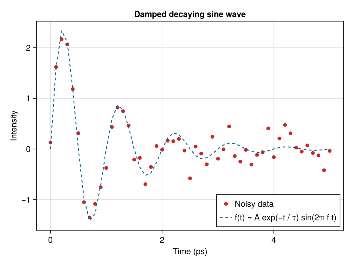
If the plot comes after the Axis definition, it will be drawn on top of the Axis and you don’t need to input the ax variable.
These are some colors that I like.
There is a full color palette at Colors.jl.
Programmatic plotting
Section titled “Programmatic plotting”Integrating programming concepts like loops and functions into plotting can be very powerful. In this example, we will use a loop to plot multiple sine waves with different frequencies and amplitudes. Let’s again use the damped sine function we defined earlier.
Image we have three sets of data with different amplitudes, frequencies, and decay time constants.
We will generate random parameters for each data set.
In the following code, we use rand(1:3, 3) to generate three random integers between 1 and 3 for the amplitude, frequency, and decay time constant.
We want to plot them all on the same axis, but vertically offset each plot so that they don’t overlap.
Let’s set these parameters first and then create a loop to plot the data.
I have also use a higher resolution for the time values to make the sine waves smoother.
ps_hires = 1:0.02:5  # higher resolution time values
num_data_sets = 3offset = 5  # vertical offset between data setsnoise_level = 0.1
for i in 1:num_data_sets    A, ω, τ = rand(1:3, 3)    intensity = damped_sine.(ps, A, ω, τ) .+ noise_level * randn(length(ps))    lines!(ps, intensity .+ (i - 1) * offset)end
In each loop, the y-axis values are offset by (i - 1) * offset, which means the first data set will be plotted at y=0, the second at y=5, and the third at y=10.
Changing the offset variable will change the vertical spacing between the data sets.
This allows flexibility and also precision in plotting multiple data sets.
We can even add a different label for each data set. Adding this and a few other styling options, we can make the plot look nice.
f = Figure()ax = Axis(f[1, 1],    title = "Time traces",    xlabel = "Time (ps)",    ylabel = "Intensity",)
ps_hires = 0:0.02:5
num_data_sets = 3offset = 5noise_level = 0.1
for i in 1:num_data_sets    A, ω, τ = rand(1:3, 3)    intensity = damped_sine.(ps, A, ω, τ) .+ noise_level * randn(length(ps))    lines!(ps, intensity .+ (i - 1) * offset, label = "Data set $i")end
axislegend(ax)f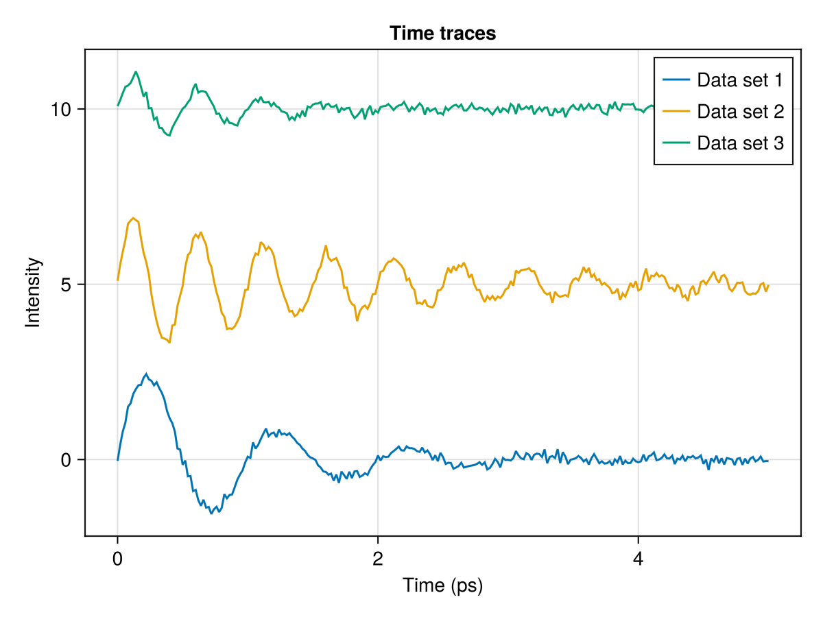
Navigating a plot
Section titled “Navigating a plot”The following and more Axis interactions can be found in the Makie documentation.
Zooming
Section titled “Zooming”You can zoom in and out of the plot by scrolling.
Holding x or y while scrolling will zoom in only on the x or y axis.
Click while holding the ctrl key to reset the zoom.
Selecting a region
Section titled “Selecting a region”Click and drag to zoom in on a portion of the graph.
This can also be done in x or y direction by holding x or y while dragging.
Again, click while holding the ctrl key to reset the zoom.
Panning
Section titled “Panning”Right-click and drag to pan the plot.
Similar to zooming, you can hold x or y to pan only in that direction.
Click while holding the ctrl key to reset the pan.
Commenting and working in sections in VS Code
Section titled “Commenting and working in sections in VS Code”By now you know that you can evaluate a single line of code by placing the cursor on the line and hitting shift+enter, and you can evaluate the entire file by pressing alt+enter.
It’s common to also leave comments in the code to explain what the code does.
You can add comments by starting a line with # or by adding # at the end of a line.
A convenient way to comment out a line is to select the line and hit cmd+/ (or ctrl+/ on Windows).
Hit cmd+/ (ctrl+/) again to uncomment the line.
Try this by changing the markersize to 10 toggling the comment keyboard shortcut.
scatter!( ps, intensity_noisy, color = :firebrick3 label = "Data", # markersize = 10,)Sometimes you want to evaluate only a section of the code.
For example, you might want to evaluate the code that generates the data and the code that creates the plot separately.
You can separate chunks of code by adding ## at the beginning of line.
Then hitting alt+enter will evaluate the code in that section (between two ## lines, or from the beginning of the file to the first ## or from the last ## to the end of the file).
Try this by separating the code that generates the data and the code that creates the plot into two sections.
Saving
Section titled “Saving”You can save the plot to a file using the save function.
You can save the plot to a file using the save function.
Save this plot to a file called damped_sine_wave.png in a new folder called output in your tutorial folder.
save("output/damped_sine_wave.png", f)Notice that the plot no longer appears in the window.
You can comment out the save line and evaluate again to see the plot.
Problems
Section titled “Problems”-
Visualize the potential of two point charges with surface plot in 3D. You will need to look up the equation for the potential of a point charge in Cartesian coordinates and how to create a surface plot in Makie.
The potential of a point charge in Cartesian coordinates is given by the equation:
where is the charge, is the permittivity of free space, and is the distance between the two charges. Place two charges, and on your plot at and .